I've definitely learnt a lot about
illustration and myself as an illustrator in this module. I've learnt a lot
about what illustration actually is and how it can be applied through the
different study tasks and PPP sessions in the studio. The presentation planning
and study tasks have helped me in discovering strengths and weakness I have
which I can now focus on improving. I feel like I've had an almost epiphany
during the illustrated self maps and being told to actually reflect on myself
has made me realize what work I want to make and what message I want to
communicate. I've thought a lot about how me, my interests and my work all
relates which is something I haven't thought about before. The metal music I
listen to, the interests I have in space etc, the games I play and the horror/fantasy
films I watch all tie in with my work and I need to let this come out through in
my work more now that I realize this. PPP has made me realize my interests and
how they could influence my work to be enchanting, magical, adventurous,
mysterious which is the direction I now know I want to go in. After realizing
all this, I managed to create an A2 poster which I'm fairly happy with. I
tested and trialed and thought about this piece a lot using analogue methods
which I am happy I did. I still have room to improve but after piecing together
what I want to include in my work and what I'm trying to communicate, I feel I
am going in the right direction with my enchanted/magical A2 poster.
Showing posts with label OUIL402. Show all posts
Showing posts with label OUIL402. Show all posts
Sunday, 14 May 2017
Evaluation
Thursday, 11 May 2017
Final A2 Poster

My final poster is finished yay
What went well
-I took my time with roughing, planning and executing this and I really got into this task
I actually enjoyed painting and really got into the zone and it was fun to go back to something that I've always loved, painting is what I've done since I can remember
-I like the colours and limited colour palette, I'm not great with colours but I like these, purples with the greys and blacks just make me thing of magic
-I personally think it creates the atmosphere I was going for but I'm unsure if my audience would get it
-Feel like I'm going in the right direction in making the work I want to make and work that has a sense of magic and mystery
Thinking about the effect I have on the audience of making them feel enchanted
-I like the texture I've created in the sky with gouache, makes it a bit more interesting than a very flat painting
-I really like the small character within the huge frame, the contrast is what I was going for
What didn't go well
- I don't know if its because I've been staring at it for hours but I don't like it that much, I keep thinking maybe its too obvious of a concept? Is the execution a bit A Level? I tried to create texture with the sky but idk if it worked
-Did I take any risks? Not really, used the media I've always loved but that's what I enjoy? But aren't I meant to be trying new things all the time
-I don't like the character, I wanted a girl to represent me and to show the contrast of the huge night sky to me but I feel like I'm not very good at character designing
But I did want to go pretty simple with the character as its not about her, its about the sky and the universe
-I feel like its a bit unoriginal and idk why? Couldn't someone else could come up with idea quite easily? I always think that though because I'm in my brain is seems obvious to me
Overall I'm quite pleased with it, think it sums up where I want to be going with my work, I tried to capture more of the magic of the universe and also the unknown. It could definitely be improved, my work will always be changing and improving.


A2 Poster Roughs

Finding this brief hard. What do I want to include? In my presentation I've been exploring incorporating the idea of magic into my work. I realised I want my audience to feel enchanted when looking at my work. I've tried to come up with an image like that. I kinda think this works? Maybe the girl is me? I think about space a lot, how mind blowingly huge the universe is, what's out there, how big stars are but they look so small from earth, it makes me feel small and insignificant though. I tried to capture more of the magic of the universe and also the unknown. I'm worried this wouldn't be translated well to the people looking at it at the show? What if it just looks like a night sky to them? It's meant to be more than that. I've been making roughs and thumbnails and what I want to show on my A2 poster. Going back to the brief I should be creating 'an illustrated diagram of yourself.'
Thinking about concept, the girl isn't necessarily me but I felt I needed a girl in there to show the contrast of the huge universe. Without the girl would it just be a night sky?
Thinking about media, I want to use paint. I chose paint so I could create texture and the colours I want, I need to experiment more with this for the final piece.
Think about composition, I like the idea of having a small girl on the A2 poster. I think the contrast of the size is really effective and communicates the message of how big the universe is and how crazy that is.
Which composition is better? I like one including the girl looking out the window because it has a sense of being on earth but looking out to the galaxies and beyond (maybe shows introversion too?) but I like the one on the right because I think it shows the contrast better of how small the girl and earth is.
I'm gonna try more roughs with a smaller girl? a bigger moon? Trying different ways to create the night sky, using more texture?
Maybe not use black, could use blues and purples?
I like the direction this is heading but definitely not there yet.
Wednesday, 10 May 2017
Planning Presentation
After my tutorial with Matt I feel a lot clear on what to talk about in my presentation.
Notes to include:
Slide 1- My past and why I'm here. I started a chemistry degree and changed my mind.
What I thought illustration was? What do I think it is now?
Slide 2- LCA first year
-making friends, going to key club to many times, too many hangovers, going to a lot of gigs, laziness
- but I learnt a LOT
Slide 3 and 4- Successes, show the work I like, sticker, how to poster
- Sticker/Illustrator/Vectors- I was all about detail before this year and I never thought I would like simple shape work but I love it? Dominic Kirkston
- I feel my mains success is actually learning the process of making work and the thought process around making work rather than the actual work I've made
-using sketchbooking and rough, not something I've done before at all really
-vectors
-transformative moments? illustrator visits, visual language module
Slide 5 and 6- Challenges
- I have definitely got out of the mindset of every sketchbook page has to be beautiful but I still have it in the back of my head that I can't take certain risks in case it doesn't turn out so well? Why am I so scared of failure?
-my attention span is about 5 seconds, procrastinating, when I am in the zone I am in the zone for a while though
- I have no confidence in my work and need reassurance all the time, I need to learn to have confidence in my work and stop letting my worries and overthinking from holding me back, I need to GO FOR IT
- show work I don't like and talk about it- illumination? persons of note?
- I think you can tell in some of my work that I've struggled with it and I haven't enjoyed making it.
- my book!!!! I think I overcomplicated this brief immensley and maybe it had a good concept and thinking behind it but I probably should have gone for a more simple idea and executed it better, made it difficult for myself
-looking back now, I didn't make the briefs my own at all like other students did, I felt restricted by some of the brief but I definitely didn't push myself enough into making it my own
-every crit I would think ' why didn't I think to do that?'
- When I struggle with a brief I hide from it
-I didn't like much of my work this year at all but I've learnt so much that I feel I'm ready to make work I like
- Maybe I'm too hard on myself, definitely worry too much about this whole style thing, I think about how to make my work abstract/illustration-y/ stylized when that's exactly what Jamie and Matt said not to do but I just need to focus on what I want to do.
Slide 7 and 8- Where do I want my work to go?
-I want to spend more time on crafting, feel I've got impatient with it when I used to spend hours and hours
- Feel like I've had an epiphany from this brief forcing me to think in detail about my work
-I want it to encompass me and my interests more and I've realised I enjoy it more then and can then make more work
- Why haven't I drawn things I enjoy drawing and only thought about what I 'should' be drawing?
-themes I want to include in my work: myth and magic, gothic, strange, other worldly, halloween, horror, space, witches.
I've realised these themes are in my life everywhere and why haven't I brought it very much into my work ? the films I watch(horror, fantasy, documentaries), documentaries on space, the unknown! the music I listen to(metal, heavy), my clothes, my bedroom, examples??
Music I like is extreme and I like that theres a lot to it GO INTO THIS MORE
WSS? ENTER SHIKARI? KORN? escape from reality, want this theme to be reflected in my work
WSS and Enter Shikari both do what they want
Korn lyrics, screaming FUCK on a breakdown? Why do I like that so much? I think its the thought of being different
What do these things mean to me?? I don't want it to be cliche, It's more than just the aesthetic that I like.. desire to have knowledge beyond ordinary human understanding! The imagination and mystery!
This is the direction I want my work to go in but I still don't know how I want to situate myself as an artist or what context I envisage my work to exist in. I think that's ok and I need to stop worrying about it so much. With more experimenting and finding what areas interest me, this will become apparent.
Slide 9- Other practitioners
Who inspires me? analyse why I like them critically
Vania Zouraliliov, Sabrina Scott, Katie Scott, Holly Exley
Holly Exley Youtube videos- showed her old work and shows she made her style and career over time, by focusing on making the work she likes
Katie Scott- botanical illustrator, all I was interested in when I was younger, I wanted to be a florist, I think I would like this but with dark colours?
I like delicate and beautiful but I also like strange and the unknown and other wordly
I find when I look at other peoples work I feel so motivated and inspired, I need to do this more
How do I want people to feel when they look at my work?
Enchanted! Under a spell, charmed.
Slide 10- Manifesto, next year
- Get up earlier
- Make the briefs my own
- Stop thinking so much
-Draw for pleasure in free time
-Stop comparing to professional illustrators and students
-Don't be defeated by others successes, be inspired
Need to make the powerpoint slides and cue cards now
I've gone over what I want to say a few times now and its about 9 minutes, maybe I should cut out a couple of things? I'm so worried that I won't present well and my mind will go blank and I'll forget stuff anyway :(
Study Task 7- Self
5 strengths as a practitioner
- Roughs and thumnailing is something I see as very important now, to try out all your ideas in an exhaustive approach and see how they look, even if they might be terrible, something successful will most likely happen
- Open minded and willing to change and try new things, at the start of the year I did not appreciate any work that was simple or shape based or didn't show a lot of skill. This has changed a lot and I can appreciate work from Dominic Kirston or Louise Lockhart and I even aspire to make work like this now.
- Experimenting with different medias and techniques is something new
- Identifying my mistakes and things I don't like to do
- Becoming familiar with photoshop and illustrator, had never tried before this year and now I feel fairly comfortable with them even though I do need more practice
5 struggles as a practitioner
- Critical reflection turns into me being negative and unconfident in my work and then not being able to execute the final image very well
- Research is not something I'm very comfortable with when it's outside of the internet and something I need to improve as it helps a lot when trying to communicate a message in my work, you need background information about the subject
- I don't think about the message being communicated in my work enough and how it is being communicated
- Craftsmanship is something I want to improve a lot, I've become impatient and I want to bring back when I used to spend hours perfecting a piece of work
- Comparing to professional illustrators is something I do a lot, when they have been practising a lot longer than I have and everyone is different anyway, I need to just be inspired by them, not demotivated
5 strengths as a student
- Always punctual to uni, actually get there 10 mins before 9:30
- Always attend, I don't like to miss anything and see every session as very important, I think the only sessions I have missed is when I was ill once
- I'm always ridiculously organised with a to do lists, kind of obsessed with them which helps when organising my time effectively to get the work done before a deadline
- I have a good work ethic and will do all tasks set with a lot of effort put in
- Using the ILOs to help me reflect on my work successfully and helps me move forward in each module
5 struggles as a student
- Something I've noticed recently is how I rush everything and I'm not sure why, I set a time for something to be checked off my to do list when I should just take my time in order to do it to my best ability but I always have something in me to rush everything
- I'm a bit lazy and don't use my time properly, I'm not massively lazy but I know I could put more effort into my work
- I'm too easily distracted and procrastinate too much, I need to delete my apps and just DO THINGS, its always 'one more youtube video..' '10 more mins in bed..'
- I can only actually make work 'when I'm in the mood', I need to change this and just sit down for 8 hours of a day and MAKE
- I need to read a book, go to the library. This is something I always think about doing and I want to do but I never do. I think it will really enrich my work and me as a person. My attention span is awful and I really need to improve it.
- I don't use 'studio development days' to my advantage, I'll do my washing, a bit of work, some cleaning, I should go to uni for the whole day to do work and then come back and sort other stuff out
Study Task 6 - Interdisciplinary
Discuss an example of a cultural product, place or interest that informs your creative practice in some way.
Focus on the synthesis between this interest and what you are trying to achieve with your work, or how it has informed your outlook more holistically.
MUSIC
I've chose to talk about music as it is definitely my biggest interest outside of illustration. Also, I've been a lot more interested in metal music since the start of this academic year. I've been to Key Club almost every Friday to the metal and rock night. The gigs I have been to are crazy; Nickelback (lol), Billy Talent, Bring me the Horizon, Don Broco, Soil, Black Stone Cherry, Skindred, Alterbridge, Korn, Limp Bizkit, Deftones. I have lined up; Slam Dunk Festival, Download Festival, While She Sleeps, Northlane, Novelists. I really love listening to music, finding new bands, going to gigs and it definitely influences me as a person. I think music and art are both in sync with each other. It's an artist trying to express themselves and communicate an message important to them. I'm find this blog post hard as I feel like its not something you can put into words and thats why these feelings can be communicated with music or art.
I often listen to SWIM (Someone Who Isn't Me) podcasts by Daniel Carter. He interviews mainly band members from various metal bands. Ones that have stood out to me are Sam Carter and Dan Searle from the band Architects. They are truly inspiring down to earth people and they use their bands popularity to highlight issues going on around the world. The whole band is vegan and they promote the charity Sea Shepard. Sam Carter is an ambassador for the charity and the band have raised a lot of awareness for this great charity who defend fragile marine wildlife and the destruction of their habitat. I think this is an amazing way to communicate this important message through art, and it's working and touching peoples lives and raising a lot of awareness. I like that these kind of message could also be communicate through art and illustration.
These kind of music and also the podcasts just inspire me immensely and make me rethink my creative outlook on life.
Tuesday, 14 March 2017
Study Task 5 - Exhibit
Out of Order at Colours May Vary
I missed the opening night of this exhibiton which would have been great to go to but I went when it was empty on a day off from uni. I liked being alone, I had all the time I wanted to study the work and not feel pressured to move around. Firstly, I thought it was so exciting and motivating to see the third years work. I feel like they probably felt a bit lost in their practice in first year like I do but probably worked hard and now they're making amazing work like this.
I really liked the layout of the exhibiton, it wasn't just an empty room like a lot of galleries, it had boxes of prints and tables of books and pottery and more books. There was just so much to see and flick through it was inspiring. I also like the arrangement of the squares on a wall, it reminded me of instagram? Which is definitely satisfying to look at.
I had a thought half way through walking round which was 'what are these actually about' and that's when it clicked that the title of the exhibition was 'Out of Order' (I know, bit slow) but I liked that everyones ideas were so varied but given the same brief. It went from a broken motel sign to a fish with legs to a big cowboy on a small horse.
My favourite work
My favourite was 'The Motel' by Dan Gilmartin
HOW did he even do this?! The use of light and dark! The composition of having the couple at the side, the bannister leading up to the motel sign and the colours? I wouldn't even know how to go about doing this but I love it. I'm unsure if the 'out of order' part is the motel sign or whats going on in the motel?? Mysterious
I also loved 'Somewhere Beyond the Sea' by Amber Kaplan. I love the idea of taking the out of order brief and making it a bit weird and funny by having a fish with human legs. I can't quite tell how she has made this piece, I can see definite texture maybe made my brushes and paper cut because of the sharp lines. I kept staring at the human legs when I was at the exhibition because of the overlapping with the seaweed. I think it gives it a different vibe of aquaticness where the fish really looks underwater.


Wednesday, 22 February 2017
Abstract Netflix Series
This documentary made me feel sooo inspired! Chris Neimann is so clever. Him talk about illustration put it in a whole new light for me. It's all about problem solving and communicating an idea. He was so determined and had a lot of perservance in solving a problem which is something I need to learn. I love these Abstract Sunday sketches that are shown below, they're so simple and so clever!! It shows he see's something like a pipette or a bread roll as something completely different.


Tuesday, 21 February 2017
The Stanley & Audrey Burton Gallery

Grant W. Miller, 2007, mixed media
I like the colours and how much is going on all the angles
I like that you see the more you look at it
It's dissimilar to my own work which I like, I should use more colour and business

Screaming Torso ll, Gyorgy Gordon, 1976, Ink on paper
Similar to my own work with the use of ink and lack of colour
I prefer quick gestural sketches to something that took a long time

At Night at Home, Gyorgy Gordon, 1991, oil on canvas
I like the interesting use of composition, and light and dark
I try to consider this in my own work but I aim to consider it more

War ll Horses, Gyorgy Gordon, 1969, ink on paper
Again I like the use of ink and the quick gestural sketch
I would give the gallery a solid 5/10. I would recommend it to a friend if they were really looking for something to do when bored in Leeds as they show a diverse range of work but I wouldn't suggest someone went out of their way to go.
Dominic Kesterton Lecture

I really enjoyed Dom talking to us about his practice and his journey. I really like his work. Some if it is just weird which I love. I also really like the balanced and random arrangements of random objects. Some of his work is funny. Some of his work is so simple. These talks make me feel better because being an illustrator doesn't seem that unattainable if you put in the hard work.
Monday, 26 December 2016
Study Task 4- Book
Non Fiction
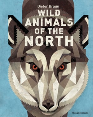
Wild Animals of the North by Dieter Braun
This book shows beautiful illustrations of animals of the northern hemisphere and facts about the animals. I like that this book is educational but also so fun as it has so many images in it. I love the simple shapes and limited colour palette used to create the different animals. I think it's so clever to make an educational book so fun with illustrations, it means so many people will read it and retain the information compared to when reading a boring looking book with facts in.
Fiction
The Fox and the Star by Coralie Bickford-Smith
I came across this book in Waterstones and I had to pick it up and have a look through just because of the cover. I just love the printing style, it has a playful sense to it as it is a children's book but also something so beautiful and elegant as well. Although its a children's book I feel like the illustrations can be appreciated by anyone of any age.


Picture
Il Etait Une Fois by Benjamin Lacombe
A pop up picture book shows 8 different fairy tales with amazing pop ups. This book was brought in by a student the other day when we had to bring in illustrated books. I couldn't stop opening this one, the pop ups are just so clever, nothing like I'd ever seen before, and I also have some kind of attachments to fairy tales since I was a child and this one contains all of them! I will be purchasing this soon. And I really want to try making my own pop up book.


Self Published
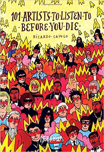
101 Artists To Listed To Before You Die by Ricardo Cavolo
I have seen this book before in a small shop in Leeds and I wanted to buy it buy poor life. And then this book was also brought in by a student into class the other day and I got to have a proper look. It's a really fun read as music is something I am so interested in. I love all the colours, it's almost like the illustrator is drawing the sound and energy. I also love the way it is written in a diary style and how the illustrator has just written down and drawn his favourite artists, made it into a book and sold it, how cool is that.

Wild Animals of the North by Dieter Braun
This book shows beautiful illustrations of animals of the northern hemisphere and facts about the animals. I like that this book is educational but also so fun as it has so many images in it. I love the simple shapes and limited colour palette used to create the different animals. I think it's so clever to make an educational book so fun with illustrations, it means so many people will read it and retain the information compared to when reading a boring looking book with facts in.
Fiction
The Fox and the Star by Coralie Bickford-Smith
I came across this book in Waterstones and I had to pick it up and have a look through just because of the cover. I just love the printing style, it has a playful sense to it as it is a children's book but also something so beautiful and elegant as well. Although its a children's book I feel like the illustrations can be appreciated by anyone of any age.
Picture
Il Etait Une Fois by Benjamin Lacombe
A pop up picture book shows 8 different fairy tales with amazing pop ups. This book was brought in by a student the other day when we had to bring in illustrated books. I couldn't stop opening this one, the pop ups are just so clever, nothing like I'd ever seen before, and I also have some kind of attachments to fairy tales since I was a child and this one contains all of them! I will be purchasing this soon. And I really want to try making my own pop up book.
Self Published
101 Artists To Listed To Before You Die by Ricardo Cavolo
I have seen this book before in a small shop in Leeds and I wanted to buy it buy poor life. And then this book was also brought in by a student into class the other day and I got to have a proper look. It's a really fun read as music is something I am so interested in. I love all the colours, it's almost like the illustrator is drawing the sound and energy. I also love the way it is written in a diary style and how the illustrator has just written down and drawn his favourite artists, made it into a book and sold it, how cool is that.
Wednesday, 16 November 2016
Study Task 3 - Applied
What does it mean to say that illustration is an applied art?
-It portrays a message and serves a purpose
-It is the bridge between an idea and an audience
-You work for people/with people
-It is a tool for story telling and meaning making
-It answers a brief
Application defines illustration
Examples of illustrated products
Mike Cortada

I chose an A Day to Remember album cover. I really like drawings with perspective, mainly because I really struggle to do it. I think this one really works well as an album cover and I really like how to title is incorporated into the whole design. I really like the limited colours used and the bright colour used for the title, very eye catching.
Nick Sheehy

This is an example where an illustration has been applied to something functional like a t shirt. I guess its a success for a functional illustration as we all need clothes but I dunno I feel like an illustration like this works better on paper just to be admired, because his skill is crazy.
Punky Pins


-It portrays a message and serves a purpose
-It is the bridge between an idea and an audience
-You work for people/with people
-It is a tool for story telling and meaning making
-It answers a brief
Application defines illustration
Examples of illustrated products
Mike Cortada

I chose an A Day to Remember album cover. I really like drawings with perspective, mainly because I really struggle to do it. I think this one really works well as an album cover and I really like how to title is incorporated into the whole design. I really like the limited colours used and the bright colour used for the title, very eye catching.
Nick Sheehy
This is an example where an illustration has been applied to something functional like a t shirt. I guess its a success for a functional illustration as we all need clothes but I dunno I feel like an illustration like this works better on paper just to be admired, because his skill is crazy.
Punky Pins

I love these pins I keep seeing everywhere and people wearing on their jacket or bag, its like carrying a little illustration around with you 24/7. I especially like this Wednesday Addams because it speaks to me, its how I feel about darkness and black and I like that there will be different pins for different people.
Alan Lee

I love everything by the fantasy illustrator Alan Lee. I feel it takes such talent to read words, imagine a fantasy world and then translate that into images. I especially love this book cover because it only shows part of a dragon rather than a whole dragon, making me want to read the book to find out more.
Simon Lewis
I saw this print at the Leeds Print Fair last week and I just love everything about it. I think the colours work so well, in that they are brighter around the performers so the eye is drawn there. I just think a gig is a perfect moment to capture in an illustration and Simon Lewis has captured the moment perfectly. It would work well on a wall just as a piece of art and I would love it on my wall but too expensive :(
Wednesday, 9 November 2016
Leeds Print Fair
I went to this print fair on Sunday, I had never been to one before and it was really exciting to see different kinds of artists sell their own artwork. It had a really nice atmosphere, felt like everyone was there for the same reason, that they were passionate about illustration etc. Kind of how I feel at a gig when there a lot of die hard fans like me knowing all the words to every song; a great atmosphere. I saw some techniques and ideas that I hadn't seen before which I want to steal for my own work. For example I saw a student selling her work that was all black ink work of forests but then splashes of coloured ink and it looked sick. Was too expensive to buy though :( Would be cool to sell my own work at a print fair.


Wednesday, 2 November 2016
Study Task 2- Practice
What is practice?


Before today's group chat about what an illustrators practice is I would have said their finished pieces, their portfolio. But after today and thinking about it in depth I'd say it is the illustrators process, their trials and errors, their inspirations and imagery, the techniques and mediums they use and the reasons why they're making the work whether it's a client or to sell as a piece of work.
Nick Sheehy
I first came across Nick Sheehy on Instagram. I instantly fell in love with his work and since then I have looked at his website, twitter and read a few interviews. I would love to buy his work but it's quite expensive and I'm a poor student.
This a quote from him: 'I like the idea of a skull embedded in a pineapple- kinda evil and absurd at the same time'
This is a quote about him that I feel really sums him and his practice up:
'Nick’s work, drawn and coloured by hand, is meticulously crafted and wonderfully executed'
Why do you like their work?
I love how unpredictable and silly some of his work is but also quite badass using a lot of skull imagery. I read that he doesn't like to explain his work and leaves it up to the views interpretation which makes it mysterious and interesting. There is definitely something mysterious and compelling about his work.
How do they make their work?
His work is drawn and coloured by hand. His weapon of choice is a graphite pencil. He might add acrylic or photoshop but he says that he is much more satisfied by analogue than digital. You can definitely see that his drawings are hand crafted with great care.
What do you think is central to their practice?
I read that his inspiration is walking, museums, natural history, film scenes, discovering new music. I can really see this reflected in his work. With all the skeleton and wild life imagery that he would find in natural history musuems or on walks.
Who have they worked for/where does their work exist?
His work has existed in a lot of exhibitions all over the world. And then he has also worked for selected publications such as magazines and books.
How does their work relate to what you do/would like to do?
I love this his work is so obviously handmade and not digital, I love that his work is so weird but works so well. I love that his work uses restricted colour and when he does use it, it is so effective. I want all this in my own work. Basically I wish Nick's work was my work. This is exactly the kind of thing I want to make -evil but absurd.

'Discovering new music makes your brain vibrate. Ideas seem to evolve out of random sketching'
Louise Lockhart Lecture
This talk from Louise Lockhart was so inspiring. It made me feel better about life. She was just so down to earth and I love that she just created what she likes to create and it worked out for her. I like that even after university she didn't know what to do or how to get a job that she wanted but it still worked out for her after a lot of hard work. It really does show that hard work pays off. She mentioned she even used to sell things through print all over me and society 6 and also enter competitions which she has inspired me to do just as somewhere to start. I felt like the talk was really personal and not things you could find out about her on the internet. On the internet you can only see where she is, the finished products and not how she got there, which can be a bit overwhelming. I need to remember that all illustrators started where I am now.
Thursday, 20 October 2016
On the Run in North Korea Exhibition
I attended the launch night of this small photography exhibition at The Brunswick. It was really insightful to see behind the scenes of the word's most secretive country. The three Yorkshire photographers did small talks on their experience in North Korea. What they told us really shocked me as they explained how different it was to what we all thing about North Korea. I personally imagined it to be a very dull, boring, conservative place where everyone had to be well behaved. But their stories and photographs showed a side to North Korea that you would not expect. The photos showed colour, life, humour and happiness. The images showed football matches, psychedelic school buildings, cityscapes and day to day life.


It was relevant to my practice as in Context of Practice I was looking at how valid history and facts can be. I was looking at how secretive North Korea is and this exhibition really opened my eyes to how things are not always as they seem in the media.

It was relevant to my practice as in Context of Practice I was looking at how valid history and facts can be. I was looking at how secretive North Korea is and this exhibition really opened my eyes to how things are not always as they seem in the media.
Friday, 7 October 2016
L5/L6 Sketchbook Crit
Today we looked at Level 5 and Level 6's summer sketchbooks. I could not believe the scope of talent and it made me so motivated to practice so I can be at that level. It is also quite disheartening to see this amazing work as I hate most of my work, but this has definitely motivated me to improve. We were meant to pick one sketchbook which was the hardest decision but I picked this one.. (unfortunately the work was not named)


I absolutely love this work. Every single page of this sketchbook was so eye catching and interesting to look at. The range of media such as ink/watercolour/collage/pen made it really gripping. I couldn't stop looking at it. This work could not be any more different to my own, I wouldn't even think about working in this way but I would really like to try some of these methods out myself. Even the simple line drawings of the leaves are so interesting to look at I LOVE IT. Also the spacey looking studies I find really alluring as space and the universe is something I am really interested in and find it so aesthetically pleasing. I love how this students work is set out with the borders, making the book look uniform and also the shape of the whole sketchbook is unusual which I like. This student seems to be very experimental which I need to adopt.


I absolutely love this work. Every single page of this sketchbook was so eye catching and interesting to look at. The range of media such as ink/watercolour/collage/pen made it really gripping. I couldn't stop looking at it. This work could not be any more different to my own, I wouldn't even think about working in this way but I would really like to try some of these methods out myself. Even the simple line drawings of the leaves are so interesting to look at I LOVE IT. Also the spacey looking studies I find really alluring as space and the universe is something I am really interested in and find it so aesthetically pleasing. I love how this students work is set out with the borders, making the book look uniform and also the shape of the whole sketchbook is unusual which I like. This student seems to be very experimental which I need to adopt.
Subscribe to:
Posts (Atom)