Monday, 26 December 2016

Study Task 4- Book

Non Fiction 
Wild Animals of the North by Dieter Braun
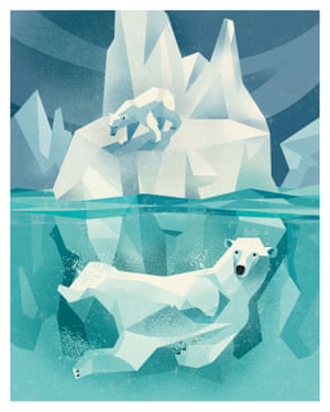
This book shows beautiful illustrations of animals of the northern hemisphere and facts about the animals. I like that this book is educational but also so fun as it has so many images in it. I love the simple shapes and limited colour palette used to create the different animals. I think it's so clever to make an educational book so fun with illustrations, it means so many people will read it and retain the information compared to when reading a boring looking book with facts in.
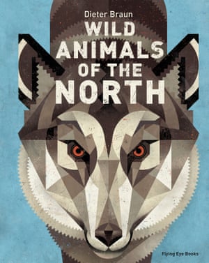
Cover
Polar bear


Fiction
The Fox and the Star by Coralie Bickford-Smith
I came across this book in Waterstones and I had to pick it up and have a look through just because of the cover. I just love the printing style, it has a playful sense to it as it is a children's book but also something so beautiful and elegant as well. Although its a children's book I feel like the illustrations can be appreciated by anyone of any age.


Picture
Il Etait Une Fois by Benjamin Lacombe
A pop up picture book shows 8 different fairy tales with amazing pop ups. This book was brought in by a student the other day when we had to bring in illustrated books. I couldn't stop opening this one, the pop ups are just so clever, nothing like I'd ever seen before, and I also have some kind of attachments to fairy tales since I was a child and this one contains all of them! I will be purchasing this soon. And I really want to try making my own pop up book.


Self Published
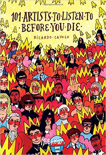
101 Artists To Listed To Before You Die by Ricardo Cavolo 
I have seen this book before in a small shop in Leeds and I wanted to buy it buy poor life. And then this book was also brought in by a student into class the other day and I got to have a proper look. It's a really fun read as music is something I am so interested in. I love all the colours, it's almost like the illustrator is drawing the sound and energy. I also love the way it is written in a diary style and how the illustrator has just written down and drawn his favourite artists, made it into a book and sold it, how cool is that.


Wednesday, 16 November 2016

Study Task 3 - Applied

What does it mean to say that illustration is an applied art?
-It portrays a message and serves a purpose
-It is the bridge between an idea and an audience
-You work for people/with people
-It is a tool for story telling and meaning making
-It answers a brief

Application defines illustration 

Examples of illustrated products

Mike Cortada

IMG_3766.jpg

I chose an A Day to Remember album cover. I really like drawings with perspective, mainly because I really struggle to do it. I think this one really works well as an album cover and I really like how to title is incorporated into the whole design. I really like the limited colours used and the bright colour used for the title, very eye catching. 

Nick Sheehy


Image result for nick sheehy t shirt
This is an example where an illustration has been applied to something functional like a t shirt. I guess its a success for a functional illustration as we all need clothes but I dunno I feel like an illustration like this works better on paper just to be admired, because his skill is crazy.
Punky Pins


I love these pins I keep seeing everywhere and people wearing on their jacket or bag, its like carrying a little illustration around with you 24/7. I especially like this Wednesday Addams because it speaks to me, its how I feel about darkness and black and I like that there will be different pins for different people.

Alan Lee

Image result for alan lee book cover
 I love everything by the fantasy illustrator Alan Lee. I feel it takes such talent to read words, imagine a fantasy world and then translate that into images. I especially love this book cover because it only shows part of a dragon rather than a whole dragon, making me want to read the book to find out more.


Simon Lewis
Image result for simon lewis illustration

I saw this print at the Leeds Print Fair last week and I just love everything about it. I think the colours work so well, in that they are brighter around the performers so the eye is drawn there. I just think a gig is a perfect moment to capture in an illustration and Simon Lewis has captured the moment perfectly. It would work well on a wall just as a piece of art and I would love it on my wall but too expensive :(

Wednesday, 9 November 2016

Leeds Print Fair

I went to this print fair on Sunday, I had never been to one before and it was really exciting to see different kinds of artists sell their own artwork. It had a really nice atmosphere, felt like everyone was there for the same reason, that they were passionate about illustration etc. Kind of how I feel at a gig when there a lot of die hard fans like me knowing all the words to every song; a great atmosphere. I saw some techniques and ideas that I hadn't seen before which I want to steal for my own work. For example I saw a student selling her work that was all black ink work of forests but then splashes of coloured ink and it looked sick. Was too expensive to buy though :( Would be cool to sell my own work at a print fair.


Wednesday, 2 November 2016

Study Task 2- Practice

What is practice?
Before today's group chat about what an illustrators practice is I would have said their finished pieces, their portfolio. But after today and thinking about it in depth I'd say it is the illustrators process, their trials and errors, their inspirations and imagery, the techniques and mediums they use and the reasons why they're making the work whether it's a client or to sell as a piece of work.

Nick Sheehy

Image result for nick sheehy pineapple

I first came across Nick Sheehy on Instagram. I instantly fell in love with his work and since then I have looked at his website, twitter and read a few interviews. I would love to buy his work but it's quite expensive and I'm a poor student.

This a quote from him: 'I like the idea of a skull embedded in a pineapple- kinda evil and absurd at the same time'

This is a quote about him that I feel really sums him and his practice up:
'Nick’s work, drawn and coloured by hand, is meticulously crafted and wonderfully executed'

Why do you like their work?
I love how unpredictable and silly some of his work is but also quite badass using a lot of skull imagery. I read that he doesn't like to explain his work and leaves it up to the views interpretation which makes it mysterious and interesting. There is definitely something mysterious and compelling about his work.

How do they make their work?
His work is drawn and coloured by hand. His weapon of choice is a graphite pencil. He might add acrylic or photoshop but he says that he is much more satisfied by analogue than digital. You can definitely see that his drawings are hand crafted with great care.

What do you think is central to their practice?
I read that his inspiration is walking, museums, natural history, film scenes, discovering new music. I can really see this reflected in his work. With all the skeleton and wild life imagery that he would find in natural history musuems or on walks.

Who have they worked for/where does their work exist?
His work has existed in a lot of exhibitions all over the world. And then he has also worked for selected publications such as magazines and books.

How does their work relate to what you do/would like to do?
I love this his work is so obviously handmade and not digital, I love that his work is so weird but works so well. I love that his work uses restricted colour and when he does use it, it is so effective. I want all this in my own work. Basically I wish Nick's work was my work. This is exactly the kind of thing I want to make -evil but absurd.


'Discovering new music makes your brain vibrate. Ideas seem to evolve out of random sketching'

Louise Lockhart Lecture

This talk from Louise Lockhart was so inspiring. It made me feel better about life. She was just so down to earth and I love that she just created what she likes to create and it worked out for her. I like that even after university she didn't know what to do or how to get a job that she wanted but it still worked out for her after a lot of hard work. It really does show that hard work pays off. She mentioned she even used to sell things through print all over me and society 6 and also enter competitions which she has inspired me to do just as somewhere to start. I felt like the talk was really personal and not things you could find out about her on the internet. On the internet you can only see where she is, the finished products and not how she got there, which can be a bit overwhelming. I need to remember that all illustrators started where I am now. 

Thursday, 20 October 2016

On the Run in North Korea Exhibition

I attended the launch night of this small photography exhibition at The Brunswick. It was really insightful to see behind the scenes of the word's most secretive country. The three Yorkshire photographers did small talks on their experience in North Korea. What they told us really shocked me as they explained how different it was to what we all thing about North Korea. I personally imagined it to be a very dull, boring, conservative place where everyone had to be well behaved. But their stories and photographs showed a side to North Korea that you would not expect. The photos showed colour, life, humour and happiness. The images showed football matches, psychedelic school buildings, cityscapes and day to day life.
On The Run in North Korea Psychedlic School

It was relevant to my practice as in Context of Practice I was looking at how valid history and facts can be. I was looking at how secretive North Korea is and this exhibition really opened my eyes to how things are not always as they seem in the media.

Friday, 7 October 2016

L5/L6 Sketchbook Crit

Today we looked at Level 5 and Level 6's summer sketchbooks. I could not believe the scope of talent and it made me so motivated to practice so I can be at that level. It is also quite disheartening to see this amazing work as I hate most of my work, but this has definitely motivated me to improve. We were meant to pick one sketchbook which was the hardest decision but I picked this one.. (unfortunately the work was not named)


I absolutely love this work. Every single page of this sketchbook was so eye catching and interesting to look at. The range of media such as ink/watercolour/collage/pen made it really gripping. I couldn't stop looking at it. This work could not be any more different to my own, I wouldn't even think about working in this way but I would really like to try some of these methods out myself. Even the simple line drawings of the leaves are so interesting to look at I LOVE IT. Also the spacey looking studies I find really alluring as space and the universe is something I am really interested in and find it so aesthetically pleasing. I love how this students work is set out with the borders, making the book look uniform and also the shape of the whole sketchbook is unusual which I like. This student seems to be very experimental which I need to adopt.

Monday, 26 September 2016

Study Task 1- Image Idea Context


Shaun Tan 'Eric'
Image result for shaun tan drawings ERIC
I chose Shaun Tan's series of illustrations called 'Eric'. The story behind this short story is so adorable and made me fall in love with Eric and also Shaun Tan's work. The story is about a foreign exchange student, Eric, who comes to live with a family and he turns out to be quite strange (in a good way) by asking unexpected questions and leaving behind a peanut. The illustrations accompanying this story makes Eric really come to life and a really likeable character.

What makes this idea successful?
The cuteness and quirkiness of the character Eric. The way Shaun Tan has drawn Eric doing different things shows his character really well.

What/who was it made for?
A part of his book 'Tales from Outer Suburbia'. I'm not sure on the intended audience but it comes across as a children's book which would also be loved by everyone. I looked at some reviews of the book and the reaction was exactly the same as mine. Everyone's response was how adorable and lovely the stories and illustrations were.

How was the image made and what works about it?
Shaun Tan's work is mainly pencil drawings and in black and white which is really effective. I love that the last drawing in the series is the only one with colour and also the typography that goes with it 'THANK YOU FOR A WONDERFUL TIME'. 

Image result for eric shaun tan   
THANK YOU FOR A WONDERFUL TIME
My reaction 'Awwwwwwwwww' *heart strings were pulled*